Industry: Consumer / Food & Beverage
Time: Ongoing
Project Type: iOS
Completion: V1 2026
Built in Cursor with Swift
After trying dozens of coffee journal apps, I noticed a pattern: they were either too sterile, too complex, or simply didn't make journaling enjoyable. The apps that existed were built for obsessives. Someone just starting to care about their coffee had nowhere to go. Orsa was built to fill that gap: a journal that feels like a companion, captures what actually matters, and gets out of the way.
TL;DR
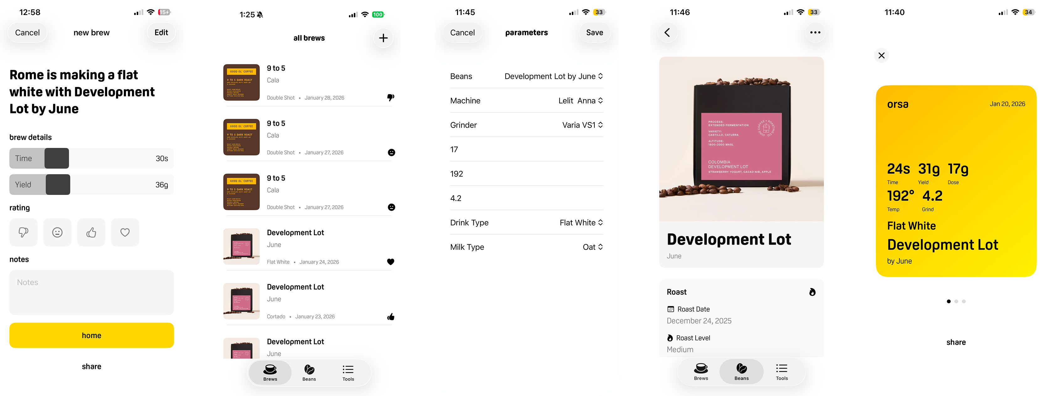
The decision that defined the product: Grind size, temperature, and drink type live behind a settings button rather than on the main logging screen. Once a bean is dialed in those parameters don't change shot to shot so surfacing them every time adds friction where the app should feel effortless. The data isn't hidden, it just doesn't need to be re-entered.
Three other calls: When you archive a bean, input the best settings so rebuying a bean gives you a starting point, not a blank slate. Rating is emoji-based, conversational rather than evaluative. The brew screen opens with a personalized headline that doubles as share copy, making the app feel like a companion instead of a form.
Biggest open question: Whether users are actually referencing archived settings when they rebuy a bean or starting from scratch out of habit. That assumption drives the most important feature in the product.
Design decisions developed through field research and Claude. Each one challenged, defended, or iterated based on my own judgment.
The insight that shaped everything
In every app I tested, archiving a bean was a dead end. You could see the entry but it gave you nothing useful, no grind setting, no temperature, no starting point for next time.
Orsa lets you store your best settings on each archived bean permanently. When you rebuy it, you're not starting from scratch.
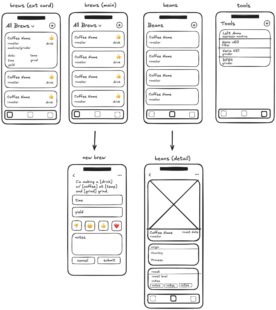
Wireframes
Why constant parameters don't belong on the main screen
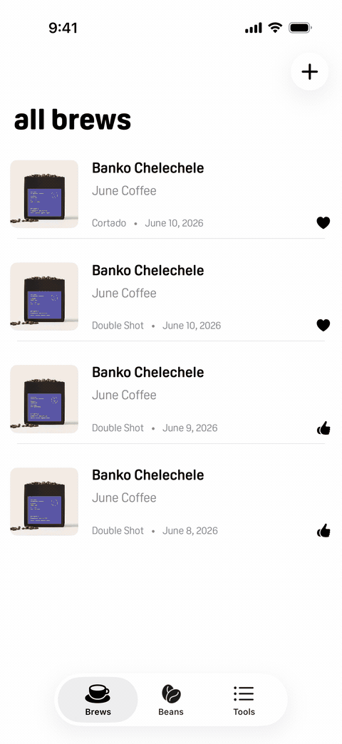
The New Brew screen logs time, yield, rating, and notes. Grind size, temperature, and drink type live behind a Brew Settings button in the top right, not on the main view.
The challenge I had to answer: grind size and temperature are missing from the main log. A bad shot can't be diagnosed without them.
It's a fair point. But it rests on an assumption I'd already tested that the people most likely to use Orsa are not swapping parameters shot to shot. Once a bean is dialed in, grind size doesn't change until the bag is finished. Surfacing it on every log entry adds friction at exactly the moment the app should feel effortless. The data isn't hidden, it lives on the bean detail page and carries through to every brew. It just doesn't need to be re entered.
Decide. Get challenged. Respond specifically. Iterate where valid, defend where not.
The other calls
Emoji-based rating over a number scale. Thumbs down, neutral, thumbs up, heart. The goal was conversational rather than evaluative, like telling a friend how a shot went. It also makes the brew log scannable at a glance in a way a row of 4s doesn't.
A personalized headline on every brew. "Rome is making a cortado with Atticus by June." A deliberate choice to make the app feel like a companion rather than a form. The same line powers the share feature, giving each brew a identity instead of a data export.
Bean photography carried through the log. Users add a photo when logging a new bean. That image shows up on every brew entry. Transforms a data list into something that feels like a personal record.
Tools and settings on one screen. Users visit the Tools screen rarely, to add a piece of gear or change a preference. Combining both keeps the navigation lean. Settings is a fixed, finite list that won't grow, so the screen won't either.
New brew, brews list, parameters, bean detail, and share screens
What I'd validate next
The archived settings assumption is the most important open question in the product. If users aren't referencing dialed-in settings when they rebuy a bean — if they're starting from scratch out of habit — the feature needs to be surfaced more actively rather than sitting passively in the bean detail.
The Brew Settings flow for users who do change beans frequently. The current flow works for the target user. For someone more advanced, a quick bean-swap shortcut on the main screen might earn its place.
V1 is espresso only. Expanding to pour over, French press, and other methods is the natural next step — but only after confirming the core logging model works for the user it was designed for.
Changelog
Jun 2026 — Version 1.0
Onboarding was redesigned into a single questions screen with hero transitions, smoother animations, and the removal of the "glad you're here" step. Keyboard focus is no longer automatic, and empty lists show a hint prompt.
The brew editor was rebuilt with an emoji rating picker, stepped sliders, and a rating fall animation. New and edit brew now share a single BrewEditorForm, with a yellow checkmark button as the primary action and sharing opening a full-screen card. Share cards gained video export, tap-to-invert color, and a fix for full IG story canvas fill.
Settings moved to the gear icon on the Tools tab, form typography was unified, legal links were wired to roe.fyi.