Industry: Nonprofit
Time: Mar 2024 – Sep 2024
Project Type: Web / Product Design
Completion: Launched Sep 1, 2024
RoyaTNA is a local nonprofit whose existing site wasn't doing the organization justice. No clear navigation, no mobile optimization, and a donation button that wasn't earning its place on the page. The client wanted to move away from a bare template. What they actually needed was a site that made it easy for people to give and get in touch.
The constraint
With a nonprofit, the site isn't a product, it's a conversion tool for two actions: donate and contact. Everything else is supporting context. That framing made the priorities straightforward. Navigation, hierarchy, and layout decisions all ran through a single filter; does this make it easier or harder to reach one of those two outcomes?
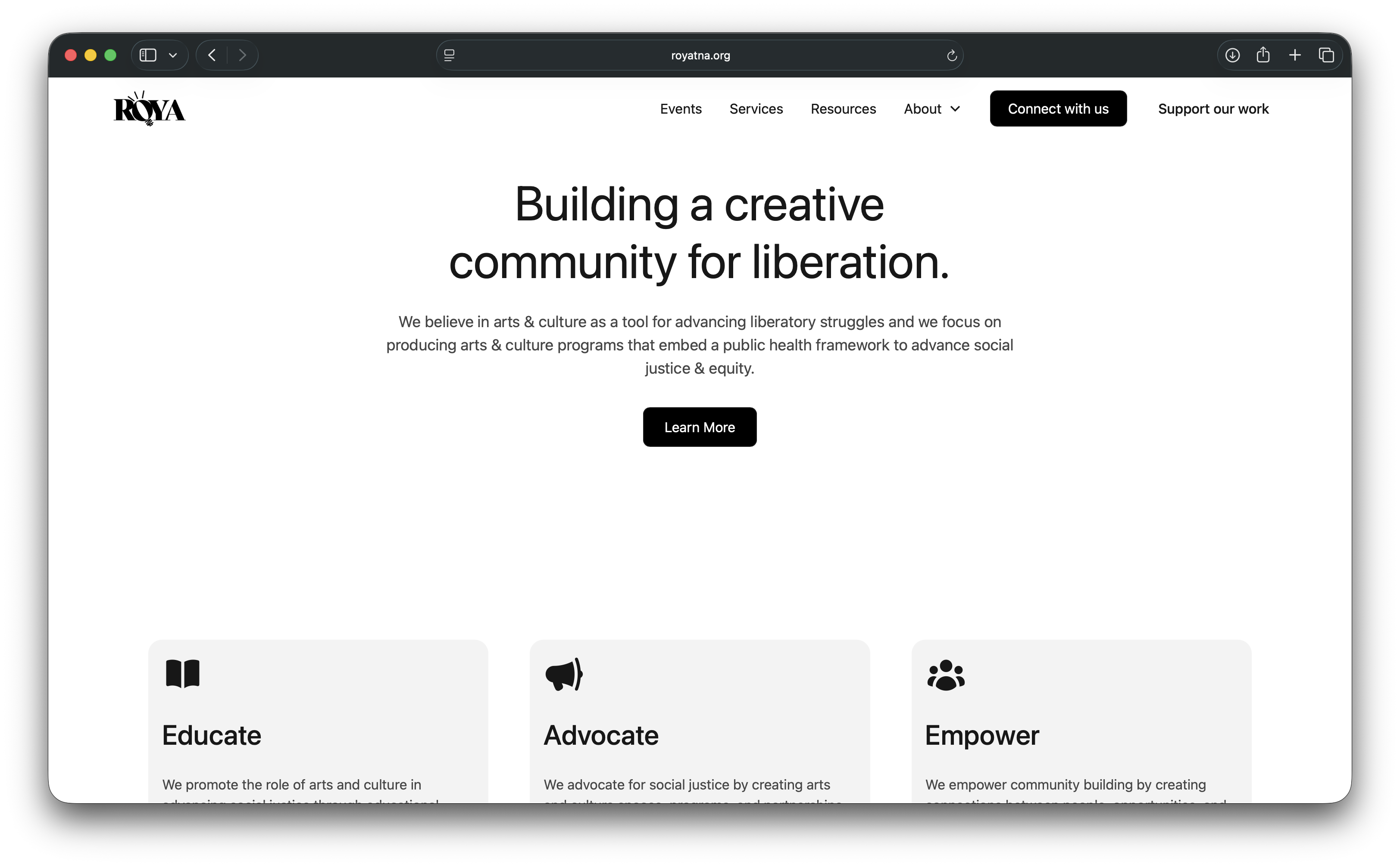
How it came together
The project was collaborative and evolved as I built. I designed custom components in Figma first, then built in Webflow, keeping design and build in conversation rather than treating them as sequential handoffs. The result was a 9-page responsive and accessible site that launched September 1, 2024.
What changed
The previous site had no clear navigation path to the donation button and wasn't optimized for mobile where a significant portion of nonprofit traffic comes from. After launch, time on site increased 30% and mobile users increased 50%. People were staying longer and reaching the site on the devices they actually use.
What I'd do differently
The brief didn't include user research and I didn't push for it. In hindsight, even a few conversations with existing donors or volunteers would have sharpened the information architecture. The decisions I made were logical, but they were mine, not validated. That's the honest gap in this project.
Visit royatna.org →